For the last several years, Website publishers including mutual fund and exchange-traded fund (ETF) firms have been encouraged to focus on the mobile user’s experience. This includes reducing the time a Website takes to load on a mobile device and enabling the taking of action via call-to-click functionality. While Google has been leading the charge, Bing also is checking sites for “mobile compatibility.”
But yesterday Google made it all real with the announcement that it will be adding a mobile-friendly label to mobile search results. At the same time, it acknowledged that it’s experimenting using mobile-friendly criteria as a ranking signal.
Awesome And Not Awesome
If your firm has made your site’s mobile friendliness a priority, it's all good. As Google rolls out the mobile-friendly label in the next few weeks, you could conceivably benefit from the designation and possibly a boost in Google search engine rankings.
But a spot-check yesterday of the largest asset management Websites, using Google’s mobile-friendly test, suggests that many firms have work to do. Note that root domains were tested, I noticed that some firms with mobile-unfriendly sites have mobile-friendly blogs.
In addition to returning either an "Awesome" or "Not mobile-friendly" result, the tool's analysis provides specific reasons and information on how Googlebot sees the page. The tool is part of a developer's guide to mobile-friendly Websites.
The Consequences
The desktop computer is no longer the leading way people access the Web. As reported by comScore, by July, 60% of U.S. digital media time was being spent on mobile devices. Financial advisors, in particular, use smartphones and tablets.
If there was any doubt before, it is now crystal clear that Google is serious about eliminating frustration for mobile searchers. When text is too small, links tiny and sideways scrolling is the only way to see all the content on a mobile device, a site will be penalized.
At the minimum, a ranking boost for sites that are mobile-friendly disadvantages the unfriendly. But also last month Search Engine Watch reported that Google was testing a mobile-unfriendly icon in search results. It’s unknown if a decision was made to eliminate the negative and accentuate the positive but OMG. No brand or Web team wants that badge of shame.
Here’s hoping you do whatever you can—as soon as you can—to avoid the unfriendly label and the resultant loss in ranking, traffic and relevance. I'm working on the same with this site.
“And, the audience sprang to its feet and cheered…”
If you’re in the online content business, such physical signs of positive reinforcement are hard to come by. But, know that what you do is appreciated and often celebrated.
The following list contains 22 pieces of content. I cheered these gems when I learned about them at one point or another in 2013 and they've stood the test of as much as 12 months' time.
As in previous Rock The Boat Marketing annual content highlights (last year’s), this is an idiosyncratic compilation across multiple digital marketing subject domains. Most of these I like for their content, some for their design, their delivery or the evolution they represent. They're presented in no particular order.
Want to play along next year? Come join me on Twitter where the majority of these highlights were surfaced by the awesome information hounds I either follow or am led to. In 2013, I also explored more content on LinkedIn, Google+ and Pinterest—follow me on those networks or just check in once in a while on this site's Resources page.
1. How Google Reads Minds
The results that Google presents to you the searcher are based on how it “understands” the words you type into the search engine. You know what you want but your search query may have literal meanings that you don’t intend.
This excellent Vertical Measures graphic from April details what Google has in place to read your mind, and how that's evolving. The screenshot below is just a slice of the full infographic.
2. No Money Manager Is An Island
Part of being social is taking part in the broader community. Quite a few mutual fund and exchange-traded fund (ETF) firms seemed to acknowledge that this year with how they managed their social accounts. We saw more accounts following others, more sharing of others’ content and an occasional #FF (Follow Friday) recommendation.
No less than PIMCO’s Bill Gross acknowledged that investment and economic insight takes a village—and people showed a lot of interest in who influences this influential money manager. From August, this is one of PIMCO’s all-time most favorited tweets. It would have been too much to expect him to use the Twitter handles.
“…The silence around the economics of content is deafening,” says Forrester analyst Ryan Skinner in this July post 16 Ways to Turn Content Marketing into Business Value. Skinner then proceeds to break down what he names as catalysts of content marketing value: brand, next click, relationship, reach, data.
Many firms aspire to be content factories today, which is all well and good. Before you plow ahead into production, read the Skinner post to make sure you’re aligning what you’re doing with what drives value.
4. While You're At It, Throw In Some Sincerity, Too
It’s a good idea to present yourself as authentic and transparent. But, um, as this Tom Fishburne cartoon from June suggests, you may need to bring that in-house.
5. DIY Dashboard Help
Marketers need to be more analytical. That drumbeat got louder and louder as the year progressed. If you’ve ever found yourself looking for Excel training applied for marketers online, you may be happy to learn about this Excel dashboard series. Written by Annie Cushing and augmented by a video or two, it started in June on Search Engine Land and then continued on Marketing Land.
6. Showing Signs Of Life On Google+
This November update isn’t on the list because the content is break-out. It’s a little more Facebook-y than I like for Google+.
But it’s an example of how the largest mutual fund company is not just experimenting but succeeding (relatively speaking) in engaging people on a social network that most investment companies have decided to ignore.
More than 700,000 people have circled the Vanguard account, 22 people +1ed this post, three shared it and 13 commented. And, what other social network (i.e., somebody else’s platform) provides such open real estate (no ads) for your message and yours alone?
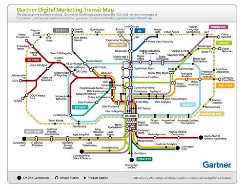
7. A Map Can Show You Where You Need To Go
Infographics were so 2010. Still, I couldn’t resist spending several minutes of my life with this Gartner Digital Marketing Transit Map released in June.
Gartner says, "Organizations should use the map to identify the connection among business functions, applications tracks and providers. Map elements can be used to find additional research or structure questions about strategy and best practices as well as providers, products and selection criteria. It is also a useful device for mediating discussions between marketing and IT."
Show this to the people in your life who think all digital marketers do is email and the Website.
8. Right Time, Right Place
Advertising a financial advisor-only conference call? On Twitter? By Royce Funds? Yes, yes and yes. In October, Royce Funds showed its leading edge lead-generation chops by employing a Twitter card to drive sign-ups.
9. Lovely To Learn From
Design is rarely front and center for digital marketers, and yet it's especially important at a time when so many clients and prospects access information via mobile devices. You’ll take a lot from this Prophets Agency presentation published last January—and follow the account to learn when the 2014 outlook is available.
Few of us have high expectations when we go to a conference Website. Oh sure, the highest-profile events command the resources to deliver a functional, pleasant experience, but the majority of event sites lack luster.
That’s not the case with this vibrant LPL Connect 2013 site. I’d bookmarked it during the August event (which I attended by hashtag only) and hoped it would still be reachable when I returned to it for this list.
Outstanding—not only did it not go dark after the event, it’s been updated. Why would you go to a conference site afterward? Just one reason, probably. LPL lets the presentation archive dominate the home page, while most event sites require attendees to go looking. All that’s missing from my cursory review of the site is a Search capability.
11. Sharing The Data
TD Ameritrade knew there was value in providing insights on what its investors were thinking. Previously, according to their Website, they'd satisfied media and others’ requests for information with opinion surveys.
That approach was upgraded considerably in January with the release of a quantitative, behavior-based index that reports on what retail investors are actually doing.
The Investor Movement Index, based on a sample of the firm’s 6 million accounts, is a tool that has ongoing marketing and communications utility. It raises the bar for other investment companies whose proprietary data contains insights when aggregated.
Wouldn’t it be cool (and ostensibly instructive) to someday get a full picture of what investors and 401(k) participants are doing, via a single site driven by the sampled and anonymized data from individual brokerage and investment firms?
12. Two Pictures = 1,000 Words
Nowadays, people are relying on mobile devices to share what they see around them and especially the news. We all need to plan accordingly.
Not that you needed the previous two sentences after looking at these photos comparing people anticipating a 2005 papal announcement in St. Peter's Square, Vatican City, and those in March 2013.
If your client or boss isn't taking mobile strategy seriously, show them this picture of the Vatican crowd: pic.twitter.com/CPlrCbwrnp
From Google Earth to Reddit to Twitter, the Internet was focused on April’s Boston Marathon-related bombings.
From my perspective, this is the best content that came out of it. The rest of us were worried about Bostonians. In an inevitably schmaltzy way (is there any other when Neil Diamond is involved?), this video demonstrated their resilience.
14. The Dope On SERPs
Google’s search engine results page (SERP) changed big-time in 2013. In October Moz provided a visual guide to all the variables that could possibly appear in (mostly organic) search results and why. Study the full guide (the screenshot below is just an excerpt) but don’t bother printing it—things may have changed since you started this post.
15. Starting With Why
Water Investing, Calvert’s iPhone/iPad app launched in November, is different from other investment manager apps in at least four ways:
It’s about something—the world's water crisis—as opposed to being a container of investment commentary and investment product information. The embedded video is effective at using the medium to communicate more than just words and images could.
Its Daily Drip is an aggregation of others’ (non-Calvert) views and updates.
It offers the tweets of not just the firm but three analysts using a #CalvertH20 hashtag.
It includes a "Play" feature that uses the device's camera to simulate a water effect. Kinda corny but something to build on.
16. A Framework For Your Work
You could land on any blog post on Avinash Kaushik’s Occam’s Razor site and find Web analytics gold. But, make a special effort to read See-Think-Do: A Content, Marketing, Measurement Business Framework. Your entire day every day can be filled in the pursuit of digital marketing tactics. This post is a nudge to be more strategic in how you think about your work and its effectiveness.
BREAKING: Sorry, I can’t let this post fly without also mentioning a December post in which Kaushik lays out a digital marketing “ladder of awesomeness.” Another must-read. You might just want to subscribe to this site.
17. Endorse Me As Father of The Bride
A chuckle is the last thing I expect when I log into LinkedIn but, no kidding, some of the photos being used for profiles are funny. This MarketingProfs 19 More Reasons Your LinkedIn Headshot May Be an Epic Fail presentation is not exaggerating. Too bad it doesn't touch on one of the types of photos I commonly see. Men in tuxedos, really?
Last week was all about learning an hour of code. I’m guessing most of you sat that one out. But this week, how about learning to just read the source code on your Website?
If your work has anything to do with optimizing your site for search engines, this KISSmetrics post from August provides an excellent foundation for how to confirm what's happening on your site. Bonus: Check other sites' source code to learn what they're up to. This screenshot is just the first example the post provides.
19. Out Of The Ashes
First there was the dramatic reading by James Earl Jones and Malcolm McDowell of Jenna’s Facebook for a Sprint commercial. I loved that. Moving onto the digital realm, on YouTube two actors re-enacted a YouTube comment war between two One Direction fans.
But the investment industry has nothing to do with most memes. We wouldn’t do the Blurred Lines knock-off videos, twerking is out of the question, and the President of the United States took part in a selfie before an asset manager CEO has.
So, while I suffered along with other financial services marketers when the #AskJPM Twitterchat imploded, I have to say that a subsequent CNBC video published the next day thrilled me. Stacey Keach provides the dramatic reading.
It didn’t go anywhere (just one tweet!) but let history show that this may have been the first stab at a meme. Thanks to my buddy Todd Donat for first sending me the link to this.
Too soon? I hope not.
20. In Another's Eyes
When one Website sneezes, do the other Websites catch a cold? Nah, the failings of healthcare.gov just inspired Slate in October to show how iconic sites Facebook, Yahoo, Amazon and Windows would have made the site over in their own image and likeness. Pretty genius.
21. Borrowing From The Journalists
The introduction of data, including visualization, can add to the usefulness of content you’re creating.
But this is yet another competency that people in marketing positions today will have to learn on the job. Most likely, you will not be crunching the numbers, you’ll be managing the data-driven work. To be an effective partner and contributor you may have to dig in.
The Marketing Arm’s Tom Edwards, the author of this contribution to iMedia Connection, sounds like he has one cool job as an evaluator of interactive/new media and emerging tech.
We’re the beneficiaries as he outlines—and provides plenty of examples of—six marketing technology trends. Included: collaborative commerce, curation, second screen and social TV, rich social media, crowdsourcing and social and CRM. The screenshot below shows the user interface of a social TV app.
This post will do it for me for 2013. Happy Holidays to all and see you back here in the first week of 2014!
If your work involves being visible on the Internet, then there’s no debating Google’s dominance over what you do. On the bright side: If Google is an overlord, at least it’s an overlord that communicates.
For example, Google recently confirmed the importance it will be placing on the speed of a Website accessed by a mobile device. According to Search Engine Land’s coverage of a recent conference, Google will be adding a ranking factor to mobile search results based on the site speed of your mobile Web pages. “Outlier sites that load really slowly will see a demotion of the search results,” although no specifics about minimum speed expectations have been made public yet.
Time To Make Site Speed A Priority
Site speed has been on the checklist for asset managers to monitor for at least a few years. But in 2013, given the impending Google search penalty and considering that target audiences (financial advisors and investors) are confirmed mobile device users, mobile site speed needs to jump up as a priority for digital teams.
The table below shows how the home pages (mostly) of the 20 largest mutual fund and exchange-traded fund (ETF) firms do in Google’s PageSpeed Insights test. PageSpeed Insights is the site that Google uses to communicate to developers about how to make sites faster.
I ran scores for all sites shown in the table on Sunday and then repeated the test on Monday. Different scores were produced for a few sites from Sunday to Monday but the differences were never more than a few points plus or minus. PageSpeed Insights' desktop scores are provided here as a basis for comparison.
According to Google, “PageSpeed Score indicates how much faster a page could be. A high score indicates little room for improvement, while a lower score indicates more room for improvement.” The test fetches a site's contents (HTML, JavaScript, CSS, images, etc.) live, using a webkit-based renderer. Results from this analysis or something similar will ostensibly influence Google's judgment of your site for mobile users.
Congratulations to BlackRock, whose iShares.com and BlackRock.com, top the list for scores. Overall, this group of asset managers has an average mobile site score of 50 points on a 100-point scale.
It’s unknown at what score Google would apply a search penalty.
Check out the PageSpeed Insights site yourself to see not just the scores but also the recommendations of what needs to be addressed for your site. Across the board, the greatest concentration of problems are found in the "Minimize the payload" category. Most sites have redirect issues, and almost all need to optimize the use of images.
One of the most significant changes to asset management marketing over the last four years has been the frequency with which Websites—and increasingly blogs—are updated. (For a blast back to the past, see this Rock The Boat Marketing post on Web content updates, published on September 18, 2008, after the bankruptcy filing of Lehman Brothers, the sale of Merrill Lynch, the announced federal bailout of AIG, etc.)
Previously, content had been valued for its "evergreen" quality. But as the markets melted down and buy-and-hold came under fire, the most general, time-tested statements about investing and investment products needed to be rethought and recast. Evergreen investment content? We may have been deluding ourselves.
The following three items are submitted for your consideration on their connectedness.
Interest In Investing Is On A Decline
While researching online last week, I came across this chart, the Google Investing Index. The index tracks queries related to investing terms (stock, gold, fidelity, oil are four of the top terms). There’s been a lot written about the disappearing act of the retail investor and here’s some more evidence. Does the trend of this line suggest a growth business to you?


 Mobile
 But a spot-check yesterday of the largest asset management Websites, using Google’s mobile-friendly test, suggests that many firms have work to do. Note that root domains were tested, I noticed that some firms with mobile-unfriendly sites have mobile-friendly blogs.

 If there was any doubt before, it is now crystal clear that Google is serious about eliminating frustration for mobile searchers. When text is too small, links tiny and sideways scrolling is the only way to see all the content on a mobile device, a site will be penalized.