Pay no attention to the graph below that suggests my excitement on Twitter plummeted from its high at the start of 2014.
 I begin the Rock The Boat Marketing annual round-up of favorite content super-optimistic (is that better?) about the quality and range of content that I stumbled upon this year. So much so that I can finally limit this list to content highlights produced by and about the asset management industry alone.
That’s a change from previous years’ lists (2013, 2012, 2011, 2010), which included a handful of investment industry examples along with mainstream content gems. This year someone else can cover the Adele Dazeem Name Generator aka Travoltifier.
Unchanged is the need to acknowledge straight away that there’s no identifiable criteria being applied here. My favorite content, numbered below and yet in no particular order, made an impression that continues as much as 12 months after I first saw it. Whether it broke new ground, introduced new ideas, deepened my understanding or changed my mind, I found myself returning to this content, emailing links to it and finding a way to work it into presentations.
1. Thank You For That Nice Introduction
Not so long ago, tampering with an investment company logo might well have been a fast way to meet the brand’s legal representation. The brand would never have publicly acknowledged yet alone embraced whatever travesty might have occurred.
That was then.
When, in February 2014, Jimmy Kimmel Live created a Kidelity Investments, Fidelity jumped on board. On Facebook and on Twitter, it shared the video and then deftly sought to use the mention to its advantage. Well played, Fidelity.
First the video and then the tweet.
2. Finally An Answer: About 3%
The rise of the “robo advisor” dominated financial advisor news this year, sharpening the advisory community’s focus on the value it provides.
Vanguard stepped up to help quantify the value in what has to be among the most valuable insight advisors were offered by asset managers in 2014.
Putting a value on your value: Quantifying Vanguard Advisor's Alpha was published in March (the table below is an excerpt from it).

3. And Where Did The Money Go?
 This infographic is genius and yet why didn't anyone think of this before? We've all seen, produced and updated the classic Asset Classes Returns matrix chart (at right is J.P. Morgan's).
In February, Kurtosys presented 10 years of fund flows into various asset classes. Shown below is just an excerpt.

4. The Keynote Speaker Becomes A Meme
Just before the mainstream adoption of social media, the event experience was getting a tad predictable, wasn’t it? Presentations prepared weeks ahead were delivered by expertly polished speakers, most of whom seemed oblivious to the audience. They were on, they were off and then they were on their way to the next gig.
Social media gives conference attendees a voice, thereby introducing an accountability edge to the experience. Plus, event content-sharing includes the stay-at-homes who can easily follow along.
 The Morningstar conference machine was humming along that day in June when PIMCO’s bond king Bill Gross took the stage wearing sunglasses and delivered some far-reaching (from The Manchurian Candidate to Kim Kardashian) remarks.
Before social media, reporters would have reported on Gross’ comments, of course. But I believe the sustained social attention—including the industry’s very own meme created by Michael Kitces—ramped everything up.
It seemed to set in motion the events that culminated in Gross leaving PIMCO for Janus, a September episode that was riveting to watch and, for some of your firms, benefit from.
5. Take Your Time, Stay A While
This was the year that asset managers joined other brands in wading into what’s called native advertising—content sponsored by an advertiser that looks as if it could be editorial.
One of the best examples has to be Goldman Sachs Interactive Guide to Capital Markets. The guide debuted on the New York Times site in February and now also lives on Goldman’s.
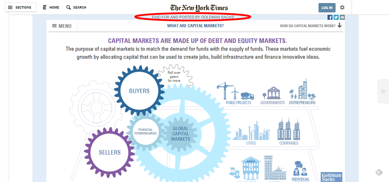
The top metric on this, according to what Amanda Rubin, global head of brand and content strategy at Goldman Sachs, told Contently, is time spent.
6. Act Like You're Human
Easier said than done, especially if you’re a quanty portfolio manager, or at least that’s been my observation. That’s why this Van Eck portfolio manager selfie from October tickled me.
Ellen De Generes and her Academy Award cronies are actors. Mugging for cameras is what they do, we shouldn’t be surprised. But when money managers think to use (or even if they were cajoled) a relatively new platform to be social and show a little personality, that’s cool.
Nobody retweeted this, though, it’s often pointed out to me. While that’s true and I wish someone had if only to encourage Van Eck, it’s not always about the retweet. Imagine seeing this tweet in your stream—four guys squeezing into the frame while taking care not to obscure the bridge behind them. This is cute. My bet is that it prompted a smile from those who did see its one and only appearance, making the kind of incremental positive impression that can be achieved on Twitter.
Sometimes you just deliver a message, you don't always get a receipt.
7. How Soon Before We’re Really All Working For Google?
In his searing contribution to the otherwise jolly
What To Give The Mutual Fund, ETF Marketer—9 Elf-perts Weigh In post (vive la difference), RIABiz’s Brooke Southall made the point, “Asset management has enjoyed one of the great business models of the past 30 years—with high profit margins and terrific scalability…[But] the need to market like your lives depend on it has come to the fore.”
While Brooke’s focus was on the uninformed purchase of online advertising, it applies, too, to what may be the most intriguing story of the year: the
Financial Times’ September report that Google two years ago hired a financial services research firm to assess how to enter asset management.
In your work optimizing your sites for search rankings, including via mobile devices, digital marketers may already feel as if they're working for Google.
Here's a short list of possible advantages that Google could enjoy as an asset manager:
- For investing, data on search volume for specific words or phrases to time the market
- For investing, use of its satellite imagery to predict company earnings
- To distribute other firms’ funds
- For relevant, even personalized marketing based on what it knows about individuals' search patterns
Watch this space.
8. Yes, Do Dignify With A Response
When something critical is written about an asset manager, the standard response is to turn the other cheek, to not engage. But there may be times to do the opposite, given the long life of discoverable Web pages.
This year saw a few firms standing up for themselves in public ways.
To wit:
- In September, AdvisorShares distributed a press release about a five-star rating on one of its ETFs. In response, ETF.com writer Dave Nadig cautioned readers not to be "starstruck" about that fund. And, AdvisorShares CEO Noah Hamman took to his AlphaBaskets blog to respond to Nadig point by point. Wow.
- No mutual fund company takes on Morningstar just because. But Royce Funds’ apparent frustration (“while both our investment philosophy and process, which date back to 1972, have remained steady over the years, most of our funds have experienced frequent movement in and out of Morningstar's equity style categories”) prompted the firm to research how common it is for funds to move between categories.
The whitepaper and accompanying blog post How Morningstar Category Flux Impacts Peer Group Analysis concludes, “Our research suggests that a fund's category is changed far more often than seems commonly acknowledged, and this should be a consideration when screening, evaluating, and/or monitoring portfolio performance.”
A subsequent video (not embeddable—click on the image to go view it) presented an interview with Director of Risk Management Gunjan Banati sits down with Co-Chief Investment Officer Francis Gannon.

9. After The TV Commercials, Content Comes Next
We don’t ordinarily think of advertising as content, but the John Hancock Life Comes Next series of intriguing television commercials are cross-channel. They serve as teases that lead to the microsite where three endings are offered for each, backed by related content.

Veteran advertisers like John Hancock know how to create commercials that are evocative, and these are terrific. If the overall program is succeeding in engaging viewers in the follow-up content and #lifecomesnext Twitter conversation, they’ve crossed a frontier not many have.
10. Dare To Be Different
Who says you can’t mention product in your blog posts? Lots of people have, over time. The idea is to engage with content that's a level above product.
But this isn’t a hard and fast rule for a business whose business is to manufacture products. Technology companies, for example, blog about their product innovations and updates.
There’s nothing poetic about this January Direxion Investments post but it’s straightforward in connecting forecasted trends with ways to use ETFs to play them. Why not try sales ideas as blog posts and see what happens?
11. It Takes A Community
I liked Jay Palter’s Top 250 Financial Services Online Influencers That You Need To Know post for a few reasons:
- Most obvious: The list itself, published in March, is a good place to start if you’re wondering who to follow on Twitter. Finserv isn’t as showy and prolific as others, and you could burn up a lot of time before finding these accounts on your own.
- The very ability to create a list of 250 names of individuals focused on the regulated financial services industry (broader than just asset management) flies in the face of those who believe not much is happening with financial services and social media. There is a community, in fact.
Lots of smart people have seized on social media for its potential to improve information exchange and overall communication, and the focused content sharing by these Twitter accounts helps foster that.
- Jay gives a good tutorial on how you might use Little Bird to create your own list of influencers for use in market intelligence. The exercise can help you see the value of optimizing your firm's social accounts with relevant keywords and hashtags that will help others find you.
12. The Benefit Of Looking At Your Own Data: The Sequel
One of 2013’s content highlights was TD Ameritrade’s creation of the Investor Movement Index, based on a sample of the firm’s 6 million accounts. It “raised the bar for other investment companies whose proprietary data contains insights when aggregated,” I wrote.

It’s back in the list this year because of a Tumblr post by Nicole Sherrod, Managing Director of Trading at TD Ameritrade, published on Yahoo! Finance. Sherrod used the actual data to challenge sentiment survey results. You have to love this subhead: "Is Investor Sentiment Like the Truthiness of a Tinder Profile?"
What people tell the American Association of Individual Investors (AAII) Investor Sentiment Survey that they’re doing is one thing, Sherrod writes, and is volatile.
But, she says, “What they actually are doing is reacting fairly consistently…Now you can see why we built this index. The IMX gives a view of reality with empirical data that shows what retail investors have actually been doing.”
13. A Definitive Study On Social Media And Financial Advisors
At this point, financial advisors’ use of social media has been a preoccupation for several years. Early on, it was enough to know that some percentage of advisors considered social media appropriate for business.
But as interest heightens among asset managers, broker-dealers and vendors, questions about advisor participation have necessarily gotten more granular. We are well past high level issues. Given the investment that’s being made in content development, training (firm/advisor) and increasingly advertising, we need to know who’s doing what where and why.
Last week Putnam shared the first of the results of an extensive survey that reports on some issues not previously researched and digs into questions just superficially covered previously. These details could provide the insight needed to optimize your strategy.
LinkedIn, for example, gets all the ink and its dominance among advisors is unquestionable. But note this finding from the full report that the highest percentage of advisors considers Twitter the best network for “cascading thought leadership.”
There is a lot here worth your attention, given the survey’s finding that more than half (56%) of advisors now say that social media plays a “somewhat significant to very significant” role versus 35% just one year ago.
(By the way, after I tweeted some of the findings last week, a few people asked whether Putnam is a client. No, it isn’t and never has been. I was excited to see the new data—and yet no exclamation points were used.)
14. Bond Lessons As Performance Art
When you’ve got it, flaunt it.
This iShares video plays to the performance chops of fixed income strategist Matt Tucker and troupe. BONDing is a 2014 asset manager video series (just two to date) that investors will both learn something from and enjoy. My favorite moment in the video below comes at 1:40. Watch for the hand, that's just people having fun. Mutual fund and ETF videos could use more of that.
Bonus: More?

Inspired after reviewing the 2014 content that has stood the test of time? Download Synthesis Technology's Win The Investment Marketing Game, a 20-page e-book that I was pleased to participate in.
This will be the final post of 2014. My sincere thanks to all who contributed to and followed the blog this year. I wish the happiest of holidays to you and yours. Meet you back here the first week of January 2015.


 Infographics


